#UserReasearch #UserInterviews #UIdesign #DataVisualisation #DesignSystem #Accessibility #Cards #Charts
Applied Works
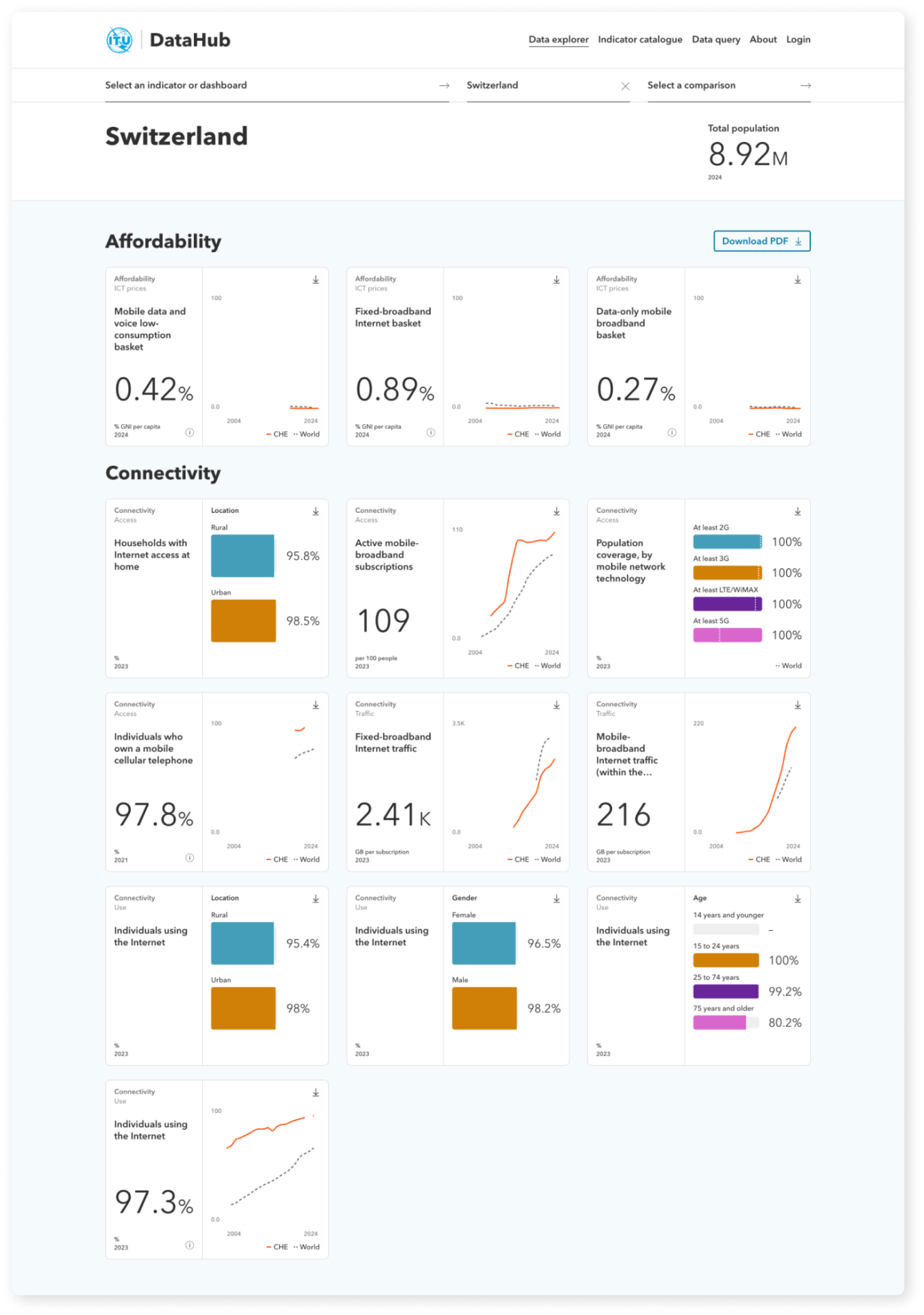
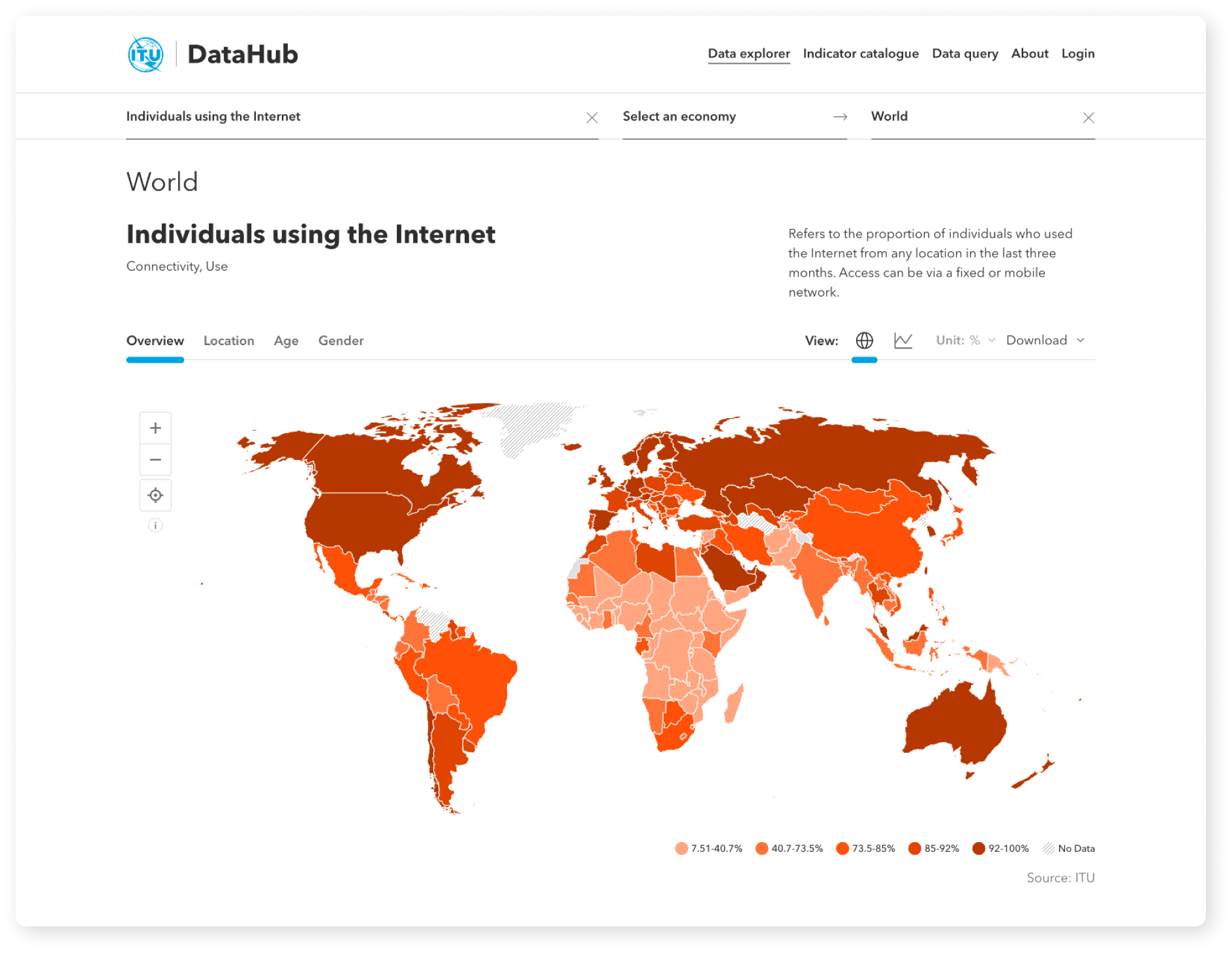
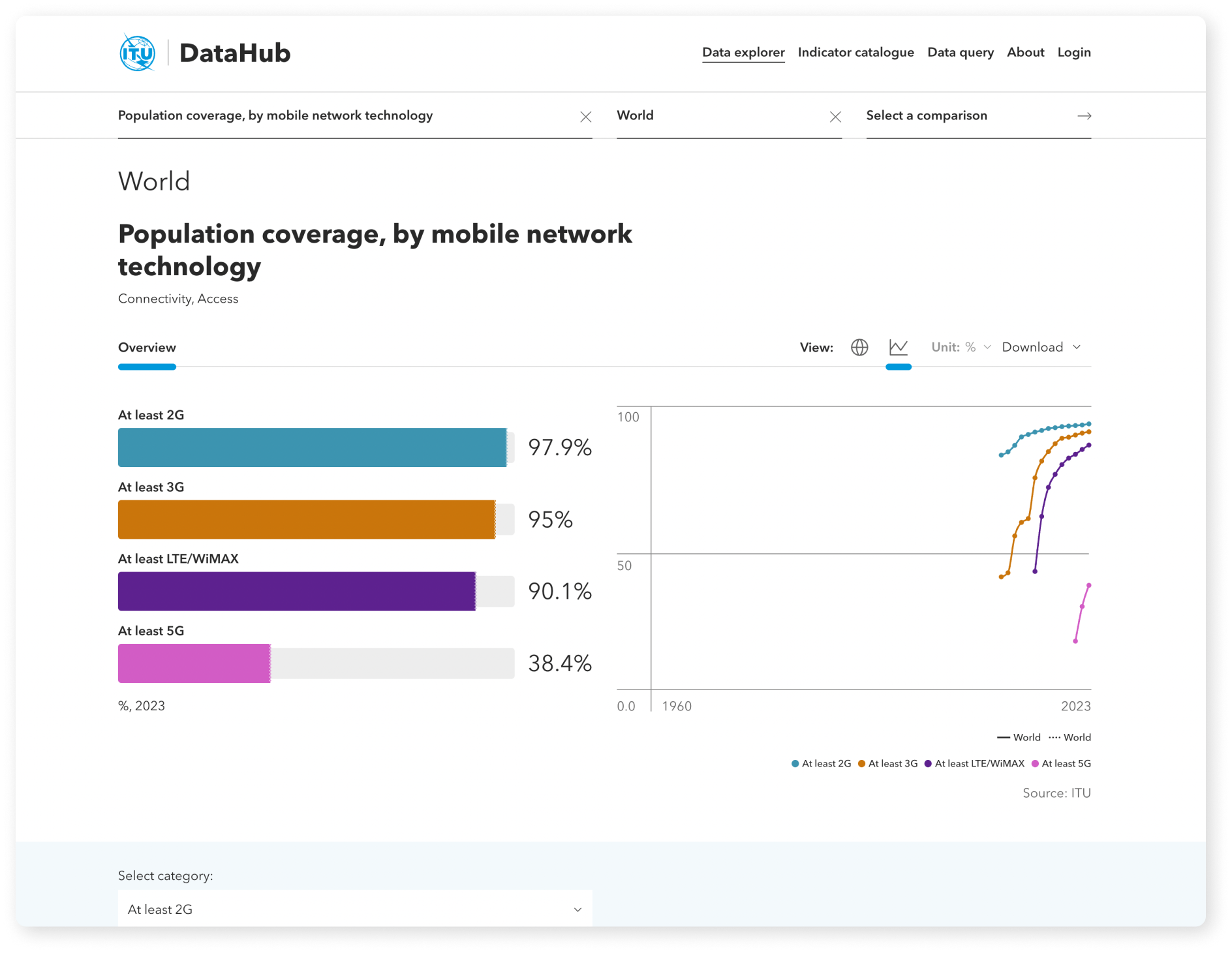
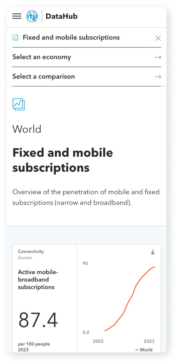
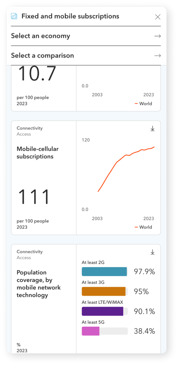
To create a modern interactive data hub (including dashboards and visual tools) that help users interpret indicators and statistics for almost 200 countries. Mobile-friendly and searchable, making data exploration more efficient.
The previous platform (ITU ICT-Eye) primarily offered static tables and basic charts for download, meaning all analysis and visualisation had to be done externally. Finding specific indicators required a multi-step process through hierarchical menus.
Mapped the structure of the previous platform and participated in client workshops to identify project requirements and user interviews to understand current needs and most common pains/gains.
Helped defining the visual identity of the DataHub. This involved ensuring alignment with ITU’s brand guidelines while introducing a fresh look.
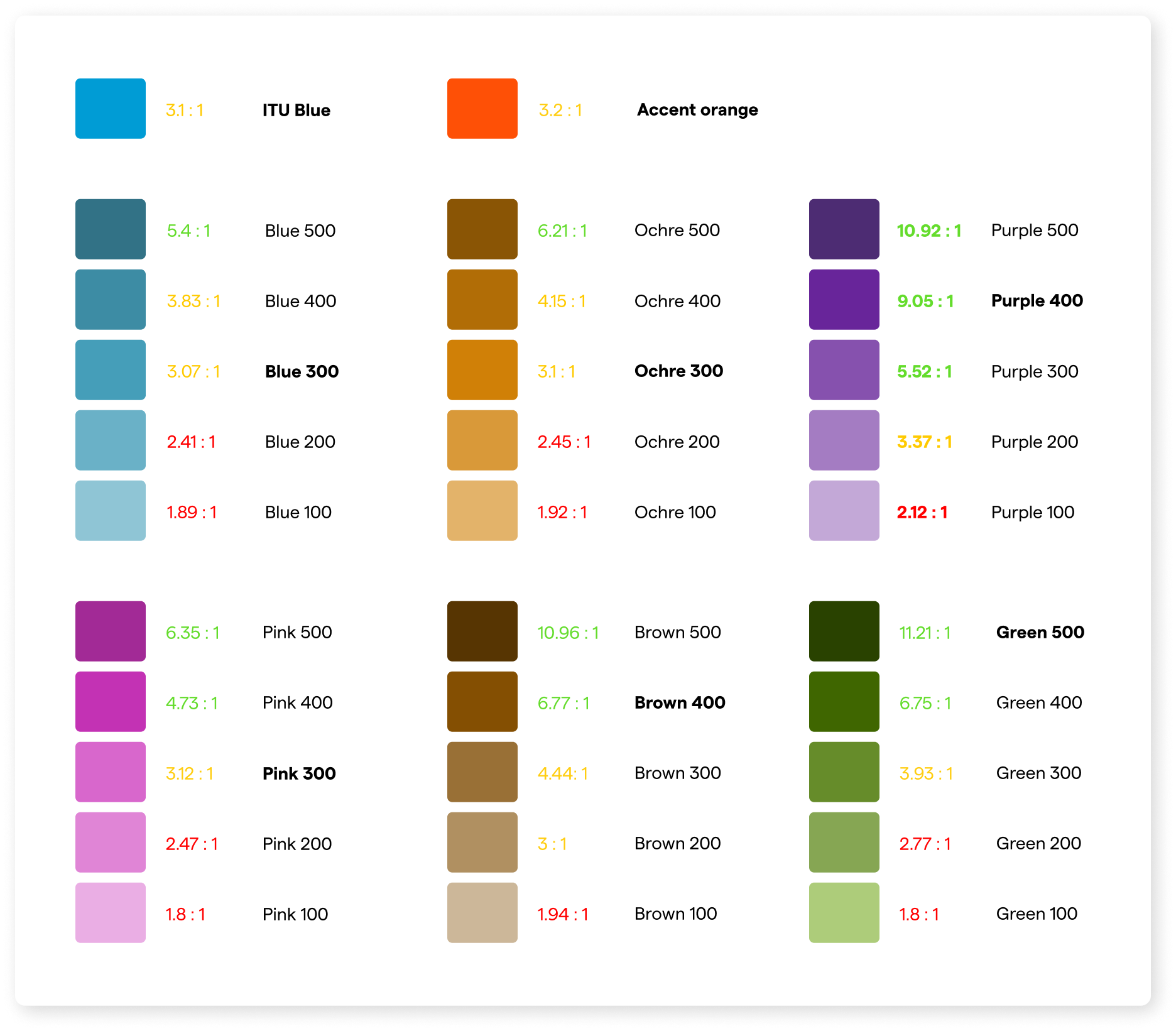
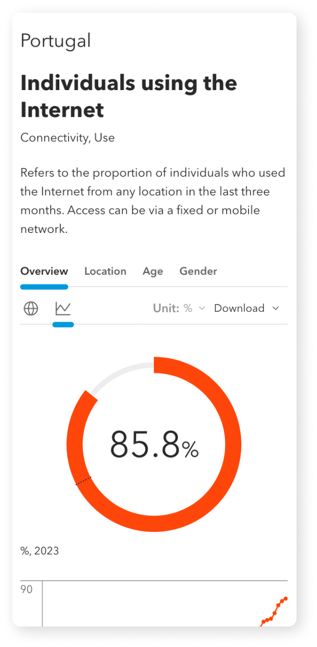
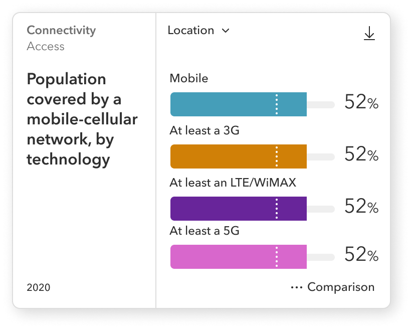
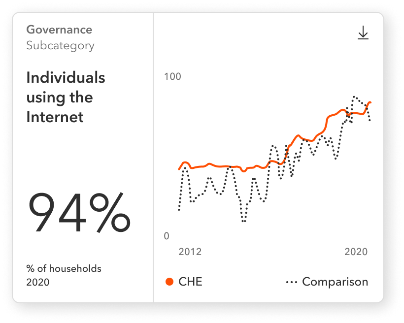
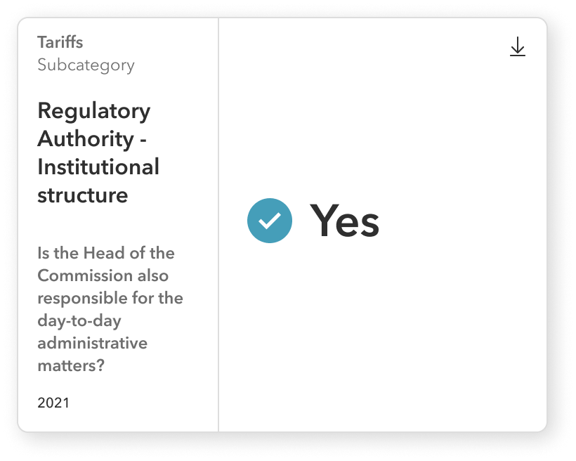
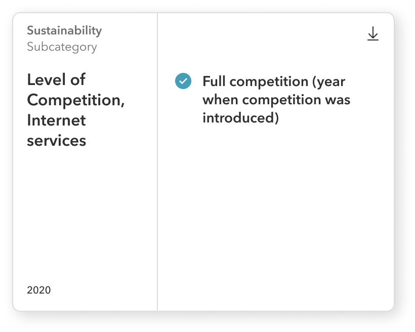
Created fully accessible colour palettes for data visualisation, custom designs for data cards, charts, dashboards and a set of templates for displaying all types of indicators.
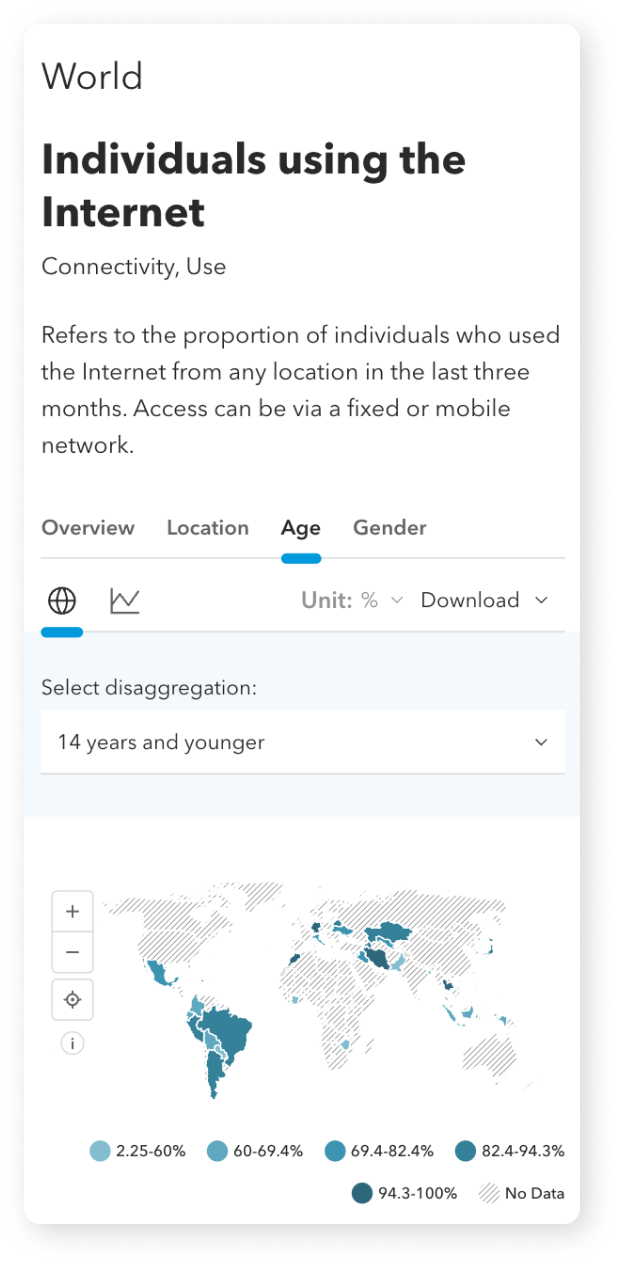
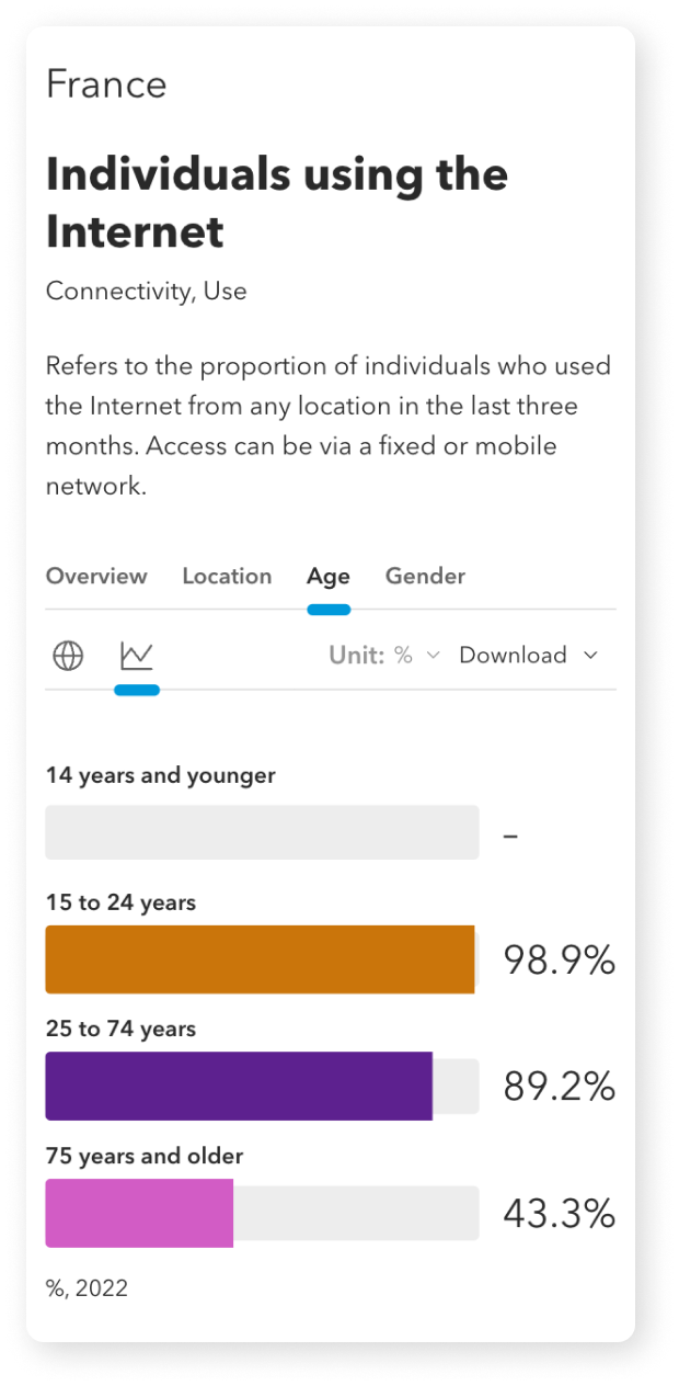
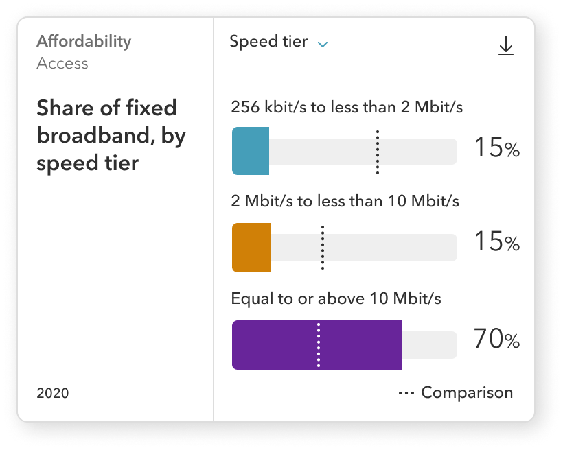
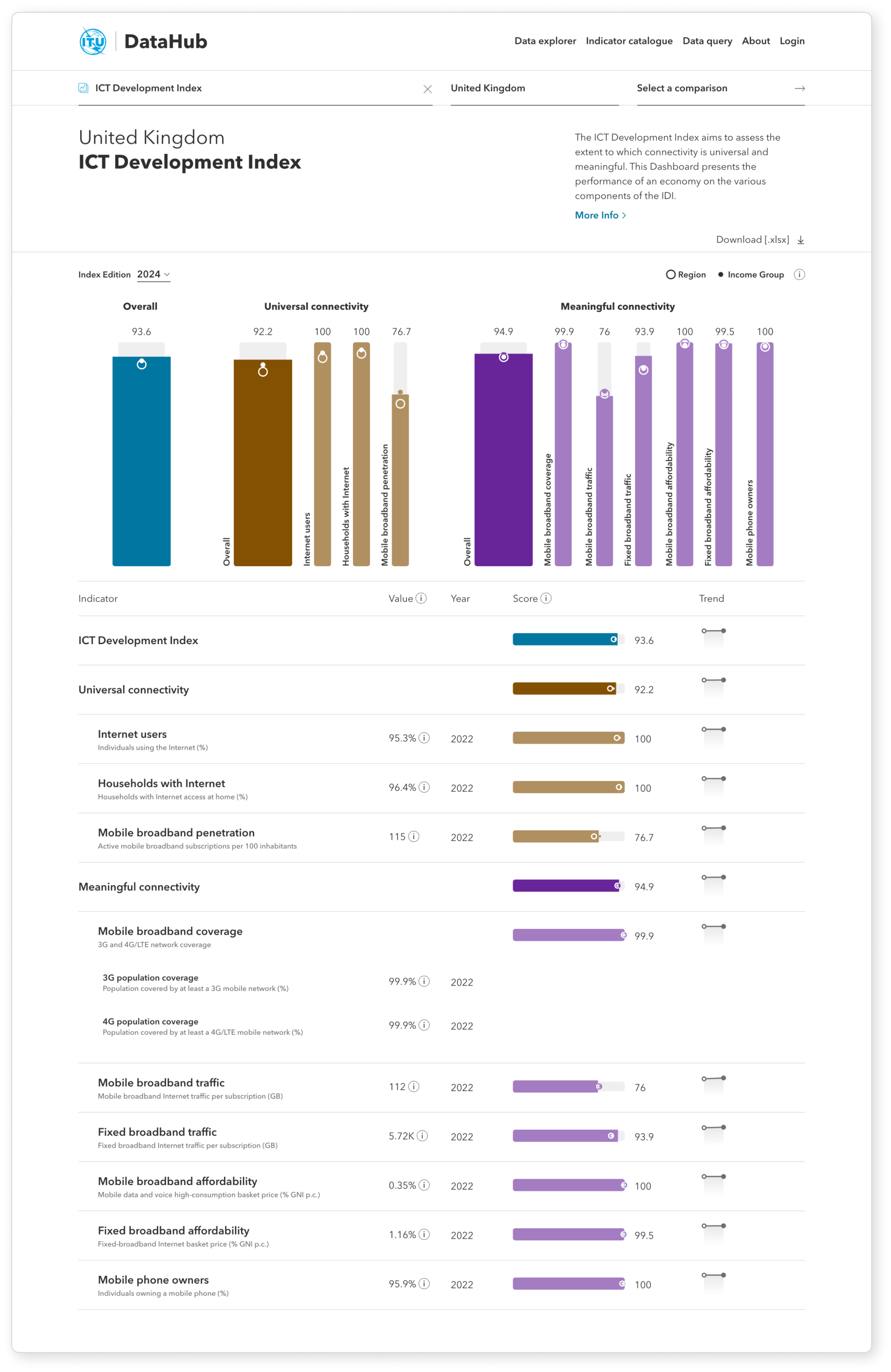
The ITU DataHub's color palette includes a specialized set for data visualization. Comprising six carefully selected hues, it guarantees accessibility—ensuring adequate contrast and color blindness compatibility—while maintaining a visually appealing design.